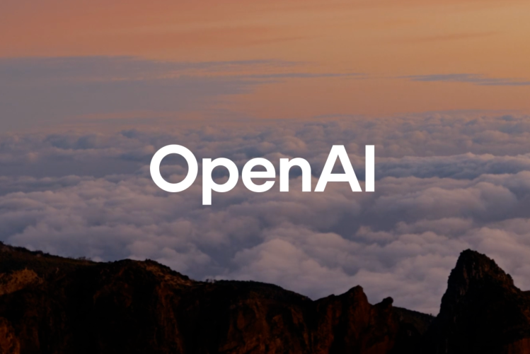
OpenAI’s big rebranding effort brings a new logo and a new typeface, OpenAI sans.
OpenAI has officially rebranded, introducing a fresh logo, a custom-designed typeface, and a refined color palette. The transformation, meticulously detailed in an interview with Wallpaper, reflects the company’s evolving identity while maintaining its core essence of innovation.
A Subtle Yet Impactful Logo Redesign
At first glance, the updated OpenAI logo might seem nearly identical to its predecessor. However, a closer examination reveals subtle yet deliberate refinements. The signature “blossom” symbol now boasts cleaner lines and a slightly larger central space, creating a more balanced and polished appearance. While the original logo was crafted by OpenAI CEO Sam Altman and co-founder Ilya Sutskever, the latest iteration comes from the company’s in-house design team, led by Veit Moeller and Shannon Jager.
Moeller explained that the redesign aimed to establish a visual identity that feels “more organic and more human.” This approach aligns with OpenAI’s mission of integrating artificial intelligence into society in a way that enhances human creativity rather than replacing it.
Introducing OpenAI Sans: A Typeface That Marries Precision and Warmth
One of the most striking changes in OpenAI’s rebrand is the introduction of a custom typeface called OpenAI Sans. Designed with a balance of geometric precision and soft, approachable curves, this new font embodies OpenAI’s vision of technology that feels human-centered.
The OpenAI wordmark now features an “O” with a perfectly rounded exterior but a slightly irregular interior. This subtle imperfection is intentional—it helps counteract the cold, mechanical feel that often accompanies tech branding. According to Moeller, the design choice ensures that OpenAI’s identity remains cutting-edge yet inviting.
Did AI Help Design OpenAI’s Rebrand?
Given OpenAI’s pioneering role in artificial intelligence, one might wonder whether AI played a role in crafting this new visual identity. Moeller addressed this curiosity, revealing that while the design team primarily relied on human expertise, AI tools like ChatGPT were leveraged to assist with calculations for type weight adjustments.
“We collaborate with leading experts in photography, typography, motion, and spatial design while integrating AI tools like DALL·E, ChatGPT, and Sora as thought partners,” OpenAI’s design team told Wallpaper. “This dual approach—where human intuition meets AI’s generative potential—allows us to craft a brand that is not just innovative but profoundly human.”
A New Chapter in OpenAI’s Visual Evolution
This rebrand marks an important step in OpenAI’s journey, reinforcing its commitment to bridging the gap between technology and human creativity. With a refined logo, a thoughtfully crafted typeface, and an evolved design philosophy, OpenAI continues to push the boundaries of AI while ensuring that its brand reflects a future where technology feels both advanced and inherently human.
As OpenAI continues to innovate, this refreshed brand identity serves as a testament to its vision—one where AI isn’t just powerful, but also designed with people in mind.


