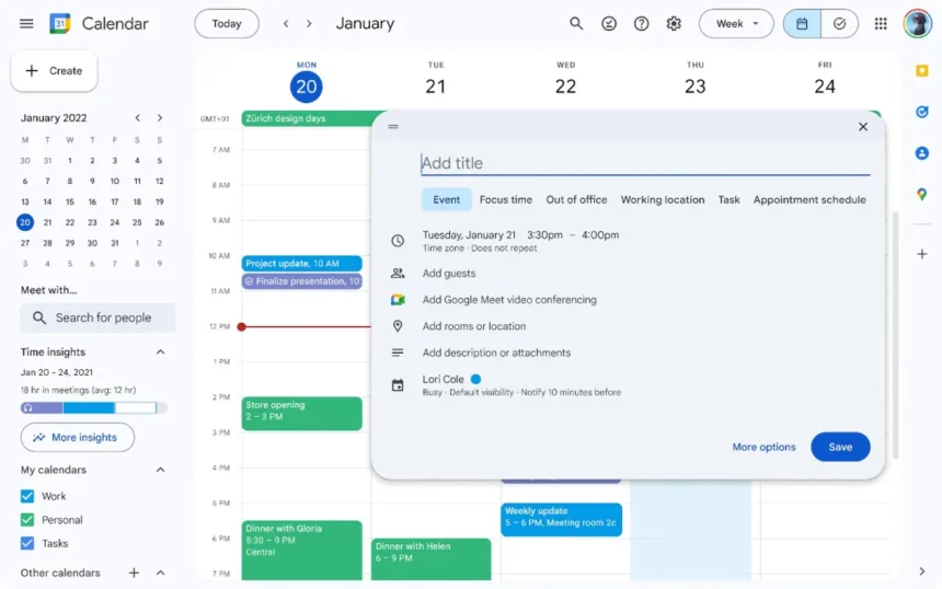
In a bid to keep its productivity suite visually appealing and user-friendly, Google Calendar is receiving a major design overhaul on its web interface. The refresh is aligned with Google’s latest Material Design 3 standards, providing a more cohesive and modern aesthetic across the Google Workspace suite. This update brings noticeable changes, from refreshed icons to newly rounded buttons, alongside an eagerly anticipated dark mode feature, all designed to enhance usability and accessibility.
A New Visual Style: Cleaner, Rounded, and More Intuitive
The refreshed Google Calendar interface is embracing subtle yet significant design changes that improve user experience. Controls like buttons, dialogs, and sidebars have been reimagined with rounded edges and updated color schemes, making the interface feel more polished and welcoming. The softer aesthetics of these rounded elements aim to create a more approachable and visually comfortable experience, while retaining the core functionality that Calendar users know and rely on.
Google has also enhanced icons and typefaces throughout the Calendar UI, optimizing legibility and clarity. This means that you’ll notice sharper, more readable fonts and clearer, well-aligned icons, which not only look great but also make navigation and task management easier on the eyes, particularly during prolonged use. These changes are part of Google’s broader mission to create an inclusive digital environment that is easier to use for everyone, regardless of their level of digital proficiency.

Dark Mode: A Highly Anticipated Feature
One of the most anticipated aspects of this update is the addition of dark mode for Google Calendar. In response to popular demand, users can now select between three display options: Light mode, Dark mode, and Device Default. This flexibility enables users to match their Calendar appearance to their environment or personal preferences, enhancing comfort during evening or low-light sessions.
The introduction of dark mode is not only an aesthetic upgrade but also a functional one. Studies have shown that dark mode can help reduce eye strain and conserve device battery life, making it ideal for both night owls and those who use Calendar on the go. Whether you prefer a bright, daylight-inspired workspace or the sleek and subdued look of dark mode, Google Calendar now offers a setting that suits your style.
Task View List Improvements
In addition to changes in the main calendar view, Google has extended the design updates to the task view list, aligning it with the new visual standards. The task list now shares the same refreshed look, creating a cohesive visual experience as you move between viewing your daily schedule and managing your to-do items.
When to Expect the New Look
Google has announced that the redesigned Calendar interface will be gradually rolling out to users over the next few weeks, so if you don’t see it yet, stay tuned. As this update reaches your account, you’ll be able to enjoy a more visually appealing, accessible, and customizable Google Calendar experience that aligns with Google’s latest design vision.
So whether you’re excited about a fresh, streamlined look, or simply ready to dive into dark mode, this Google Calendar update has something for everyone. Get ready for a smoother, more refined way to organize your time.


